A business application for three profiles with radically different needs. The real challenge wasn't technical: it was making a complex logic invisible for those who don't need to understand it.
Context
Pépi+ was born as part of my BTS SIO SLAM PPE project. The goal was to fully design and develop, over four months, a web-based stock management application for a nursery from database modelling through to final delivery.
The business context was shaped by strong regulatory constraints: the company grew and resold plants at different stages of growth, so each product had to meet strict health traceability requirements, from the nursery of origin to the final order.
I'm telling this project from a design perspective, not a code perspective. At the time, my instinct was technical I thought about data architecture before thinking about usage. Pépi+ is the project that forced me to change that order.
The Challenge
The core of the problem lay in the duality of the inventory. The nursery managed two asynchronous flows: real stock (plants physically grown on site) and virtual stock (plants available from partner suppliers). While the database treated these as two distinct entities governed by different business rules, for the field worker facing a customer, the reality was singular: is the product available or not?
Bridging that cognitive gap between the complexity of the technical architecture and the user's mental model became the guiding thread of my approach.
Moreover, the tool had to serve three profiles with orthogonal requirements: an administrator responsible for the system, a team member under heavy operational pressure, and an external partner demanding confidentiality. Taking the easy route a single interface simply restricted by access rights would have been a UX mistake. I took a different path.
User Research & Segmentation
The brief specified that nursery staff have no IT skills. That sentence changed my approach. A user who can abandon the tool at the first friction point isn't a training problem. It's a design problem.
So I decided to treat each profile as a standalone product three distinct usage contexts, three experiences designed separately.
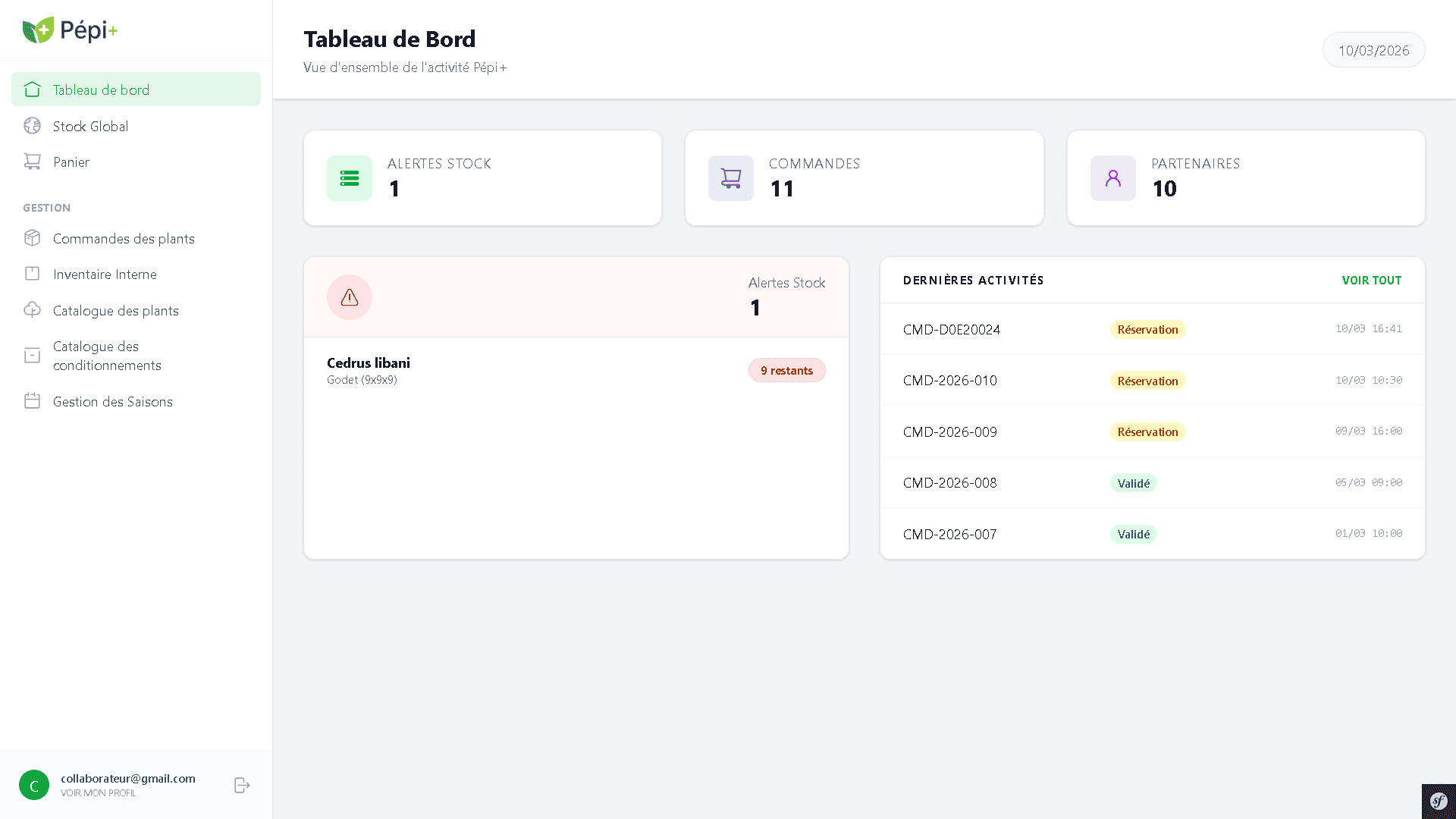
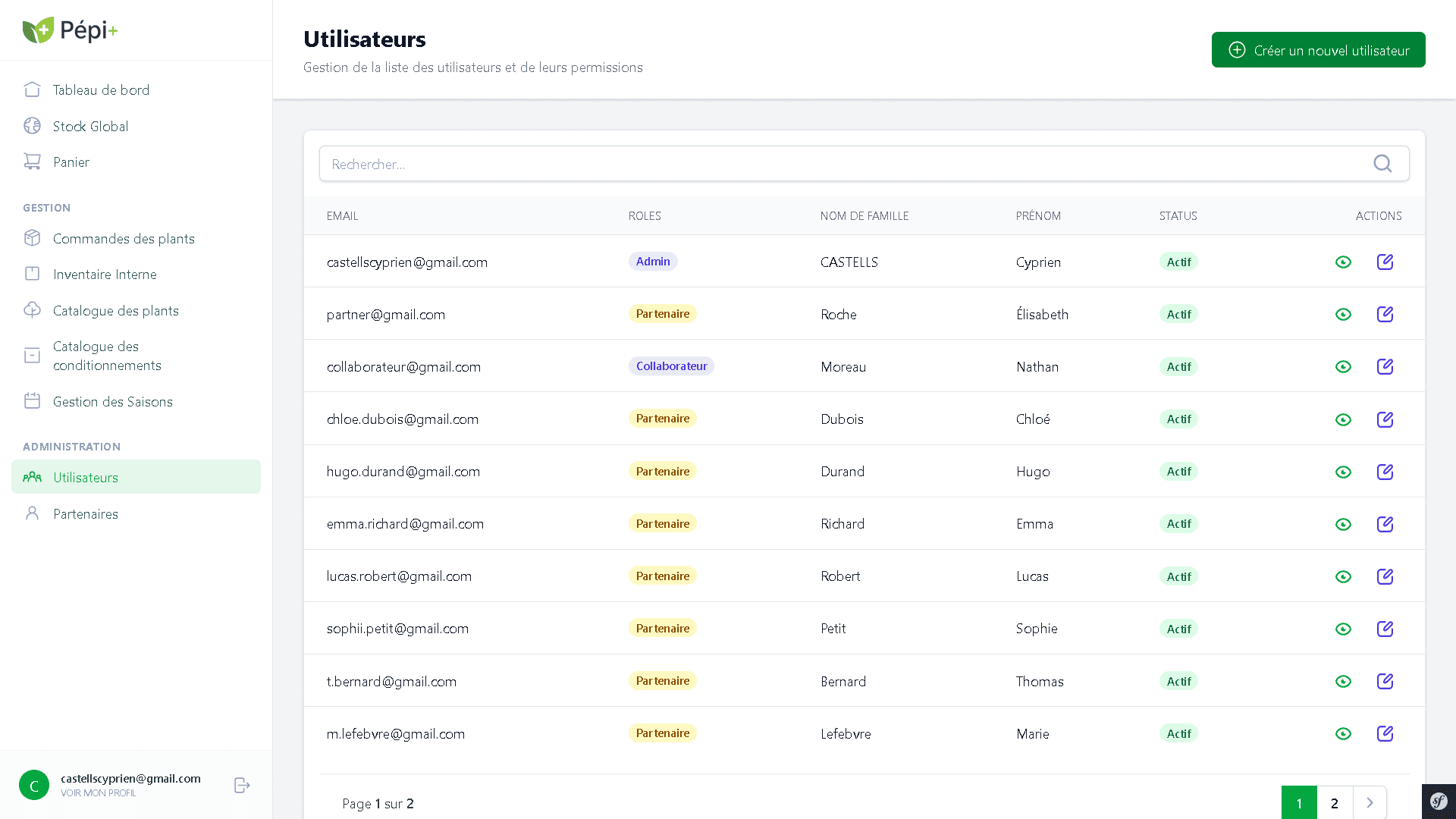
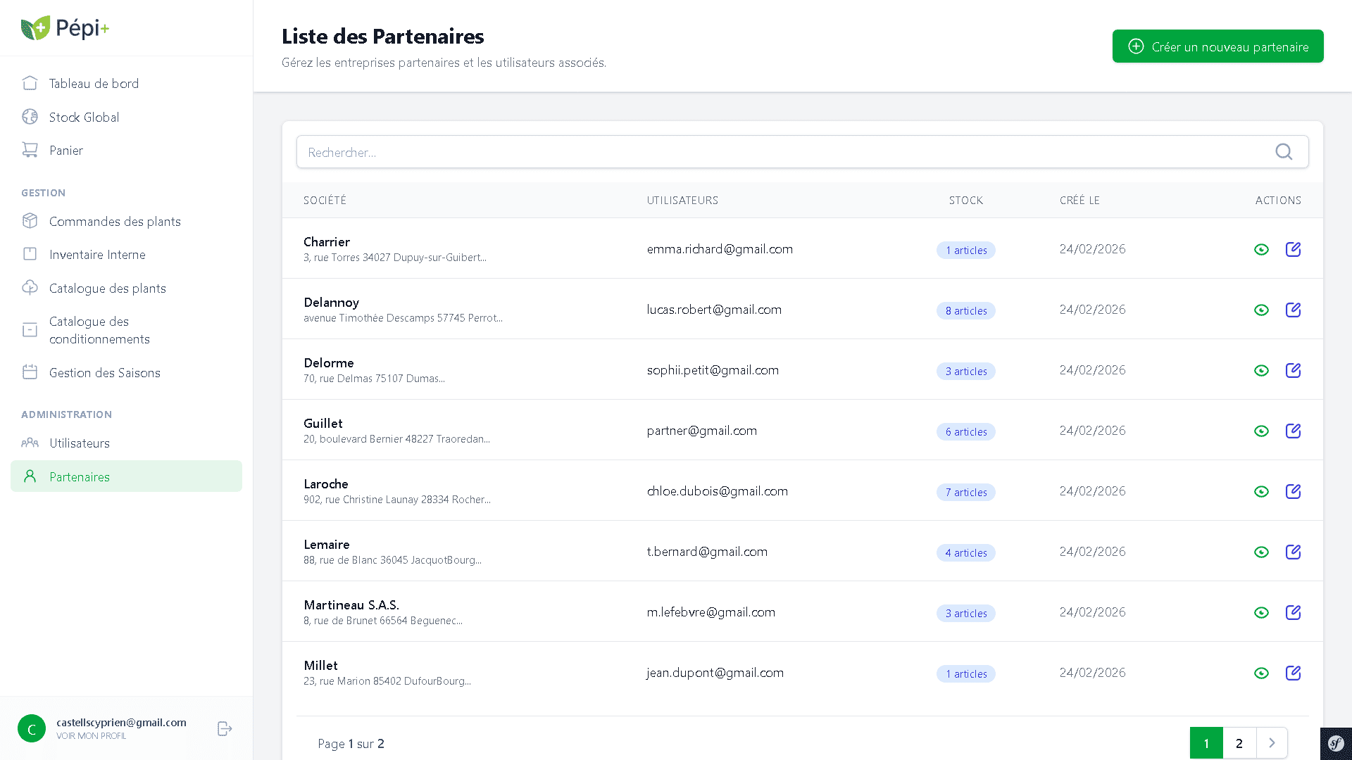
The administrator is the only one with a complete view of the system. They create user accounts, register partner companies and link them to their access credentials. They define who can do what, assign roles, and manage passwords when something goes wrong. Their interface had to let them manage all of this effortlessly: see stock levels, active orders, recent activity and act in a few clicks when something goes wrong.
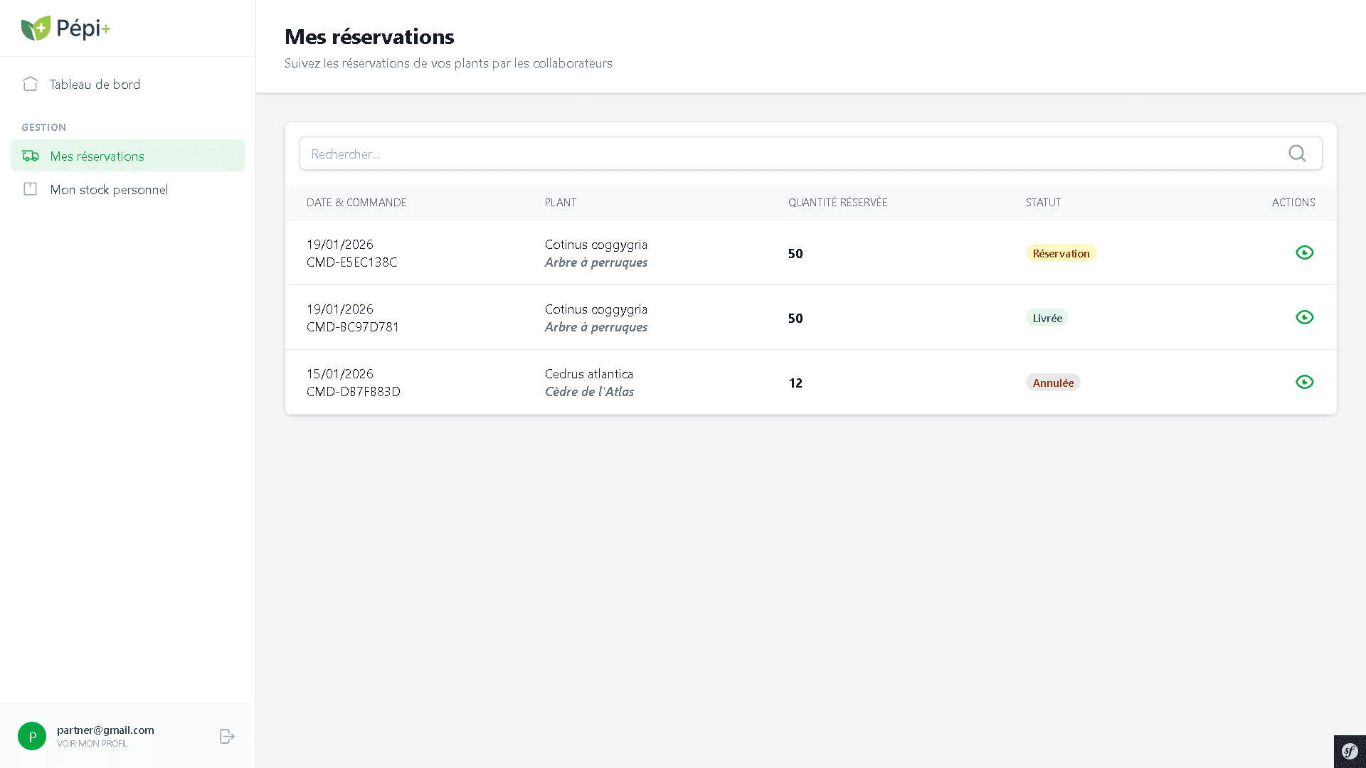
The team member works under the pressure of commercial service. When a customer is waiting for an answer on a plant's availability, there's no time to wonder whether the stock comes from the nursery or a partner supplier. Every extra step is a source of error. Their interface had to be stripped to the essentials: find quickly, reserve without friction, get instant confirmation.
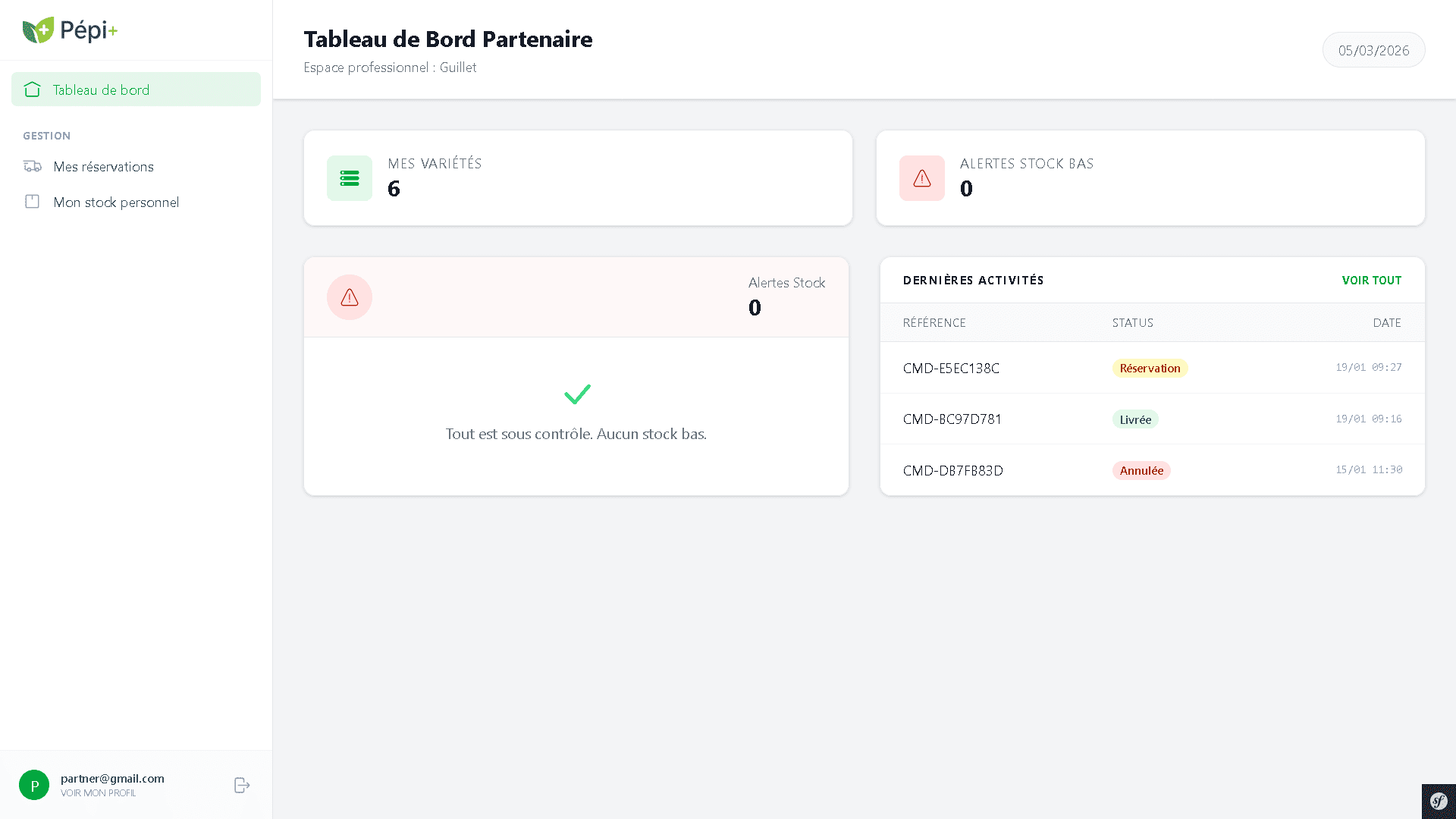
The partner supplier has yet another relationship with the tool. They're not a Pépi+ employee. Their account is created by the administrator, their scope defined in advance. If they sense they're sharing a system with other parties, trust erodes. Their space had to work like a dedicated tool, focused solely on their stock and the reservations placed on it with no third-party data visible.
Information Architecture
Modelling the database was my first act of design. By embedding health traceability criteria (origin, production season) at the root of the database, I allowed the interface to present this information transparently, with no extra interpretive effort for the user.
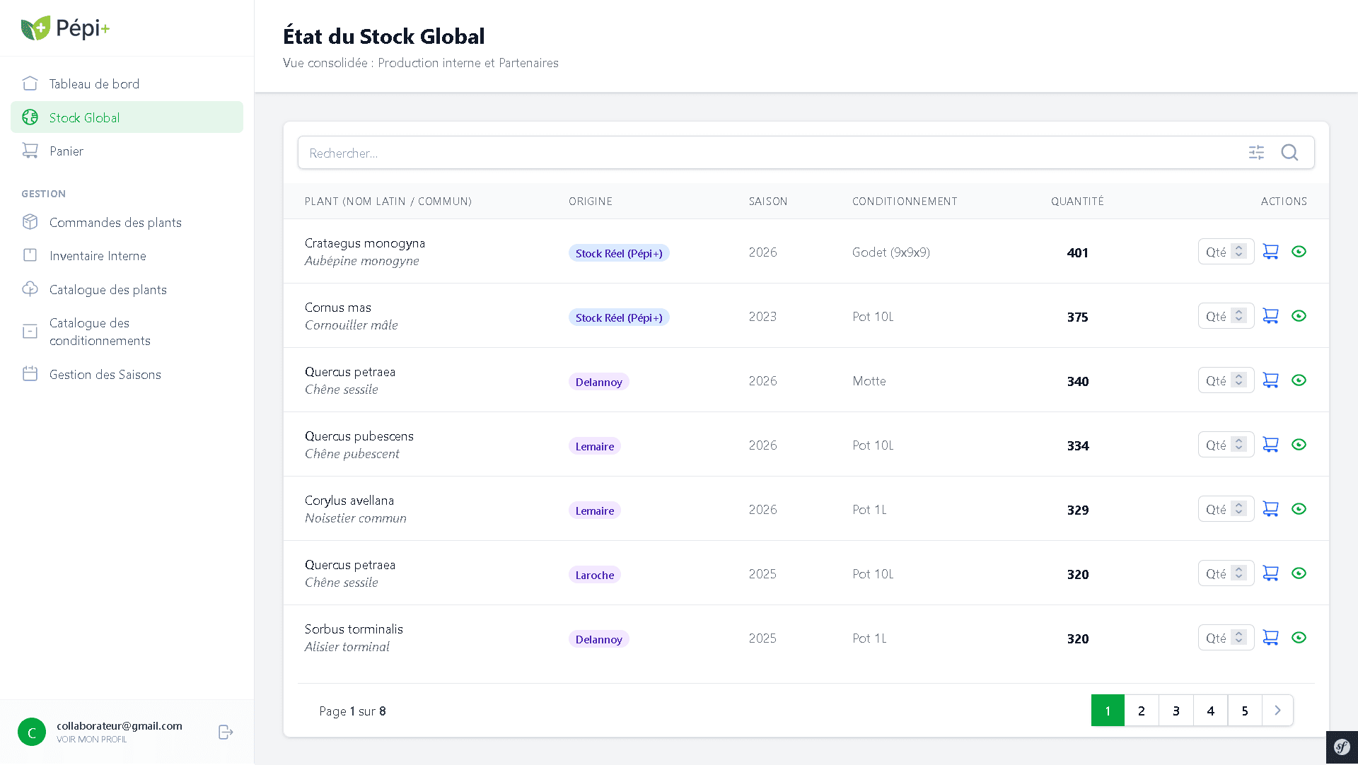
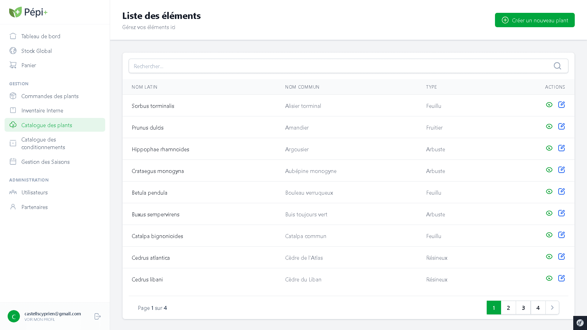
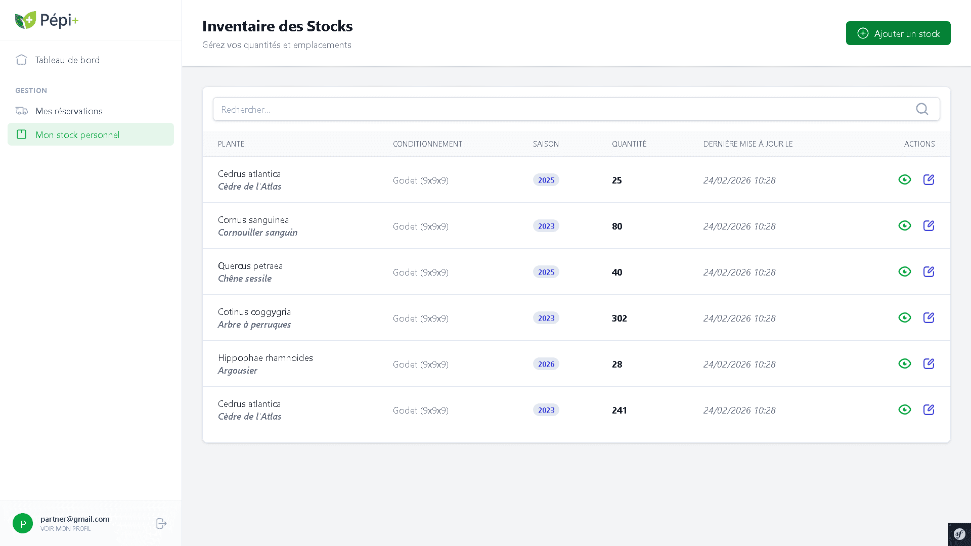
The most structural decision came next: how to display the two stock types? A developer's logic would have dictated two separate tabs (Real Stock / Virtual Stock). The UX approach favoured a consolidated view. A single table aggregates all data, reducing the technical distinction to a contextual attribute (origin and season shown on each row).
This choice taught me a fundamental design principle: hiding technical complexity from the user to smooth their journey.
Interaction Design
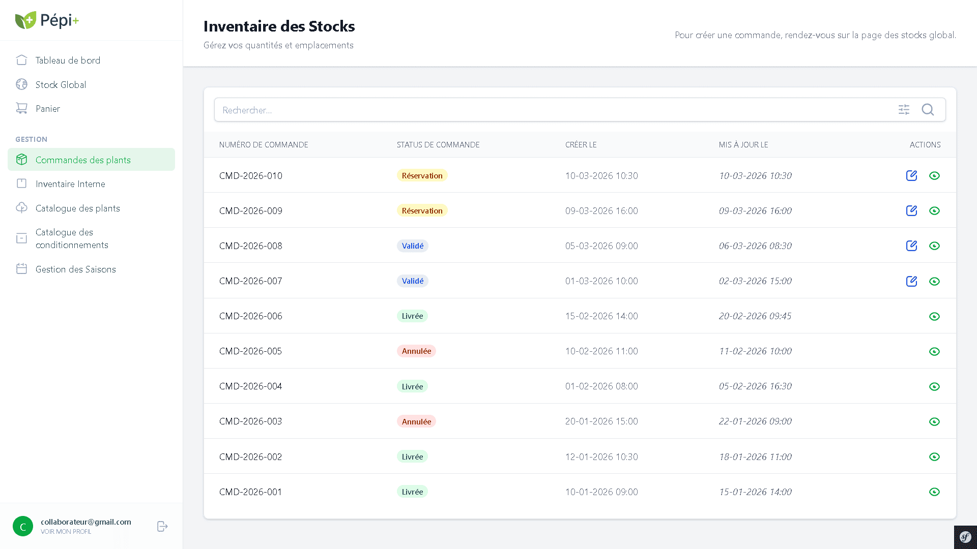
Behind a simple reservation click lies an ecosystem of complex actions: automatic decrementation of the right stock (real or virtual), recording traceability invariants, and triggering email workflows to partners.
I had a simple rule: complexity belongs to the system, not the user. The order form only asks for what the team member actually knows which plant, what quantity, which customer. Stock decrementation, traceability, partner notifications: all handled in the background, with no one needing to think about it.
Design System & Interfaces
Pépi+ is not divided into permission levels, but into three distinct products, each calibrated for its own usage context.
Managing everything without searching. The administrator is the system's sole entry point: they create accounts, register partners, assign roles and manage access. Their dashboard groups stock alerts, active orders and recent activity so they know at a glance if something is wrong, without having to navigate to find it.
Find quickly, reserve without friction. The catalogue and stock view are stripped to the essentials: the plant, its availability, its origin. The reservation's complexity stock decrementation, traceability, notifications disappears behind a single simple form.
Only what belongs to them. Their account is created and bounded by the administrator. Their space works like a dedicated tool: they manage their own stock season by season, and view reservations placed on it. A partner who logs in should never sense they're sharing something with others. It's a matter of trust as much as security.
Retrospective & Learnings
On Pépi+, I stopped thinking like a developer. Not because someone told me to but because I saw what it looked like not to: a technically correct tool that was unusable in practice.
The consolidated stock view, the form reduced to three fields these choices didn't come from a UX course. They came from a question asked at every screen: what does this person need to do, here, right now? Everything else was noise.
This is the project where I realised design interested me more than code.