
La Pradella
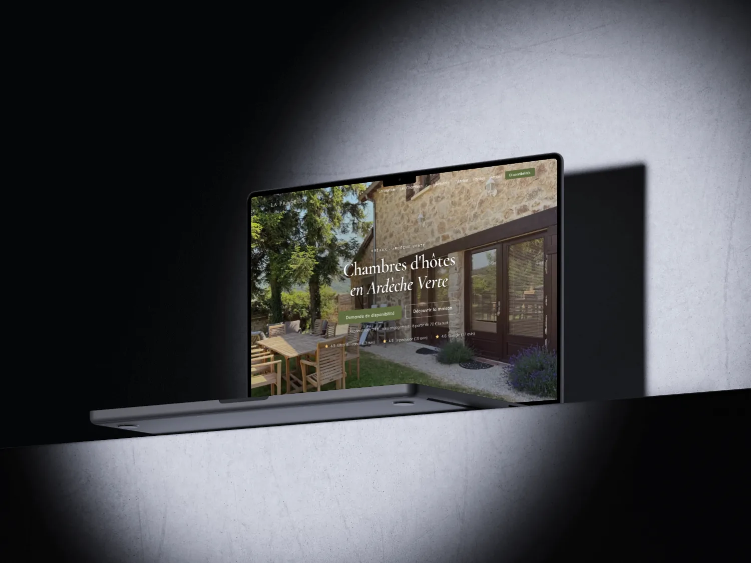
A family-run guesthouse in the Ardèche Verte, a dated WordPress site, and bookings slipping away to commission-based platforms. A redesign built to win back direct bookings.
The Context
One brief hiding two projects
La Pradella is a family-run guesthouse in Préaux, in the Ardèche Verte. Olivier and Edwige have run it since 2007: four bedrooms, a pool, a host's table and six thousand square metres of garden. Both photographers and woodworkers, they also keep a craft studio alive, where frames from old barn wood, trays and lighting are made.
At first, they only asked me for one thing: an online shop for the studio, to sell beyond consignment and passing guests. But at our very first meeting, the other need was obvious. Their guesthouse site, an old WordPress build unfit for mobile, needed a rebuild too. I offered both. They said yes.
I delivered both sites in parallel. This case study covers the guesthouse site.
It was my first freelance project as a registered sole trader. Everything ran through me: scoping, quoting, design, build and launch.
Discovery
Listening on site before drawing
Before drawing anything, I listened. A meeting at their home, my questions ready. Then a look at what already existed: the old site, but also their pages on booking platforms and every review left over the years.
The old site was full of blind spots. No real mobile version. Underused photography. A host's table and local activities almost invisible. And a form so dull that bookings drifted straight to Gîtes de France or Booking, commissions included.
Two findings changed everything. First, Olivier and Edwige are photographers: their images were already stunning, they just needed room. Second, the best views, the panoramas and the estate seen from above, were nowhere to be found. Even though that is exactly what people come here for.
Edwige added one important point: the pool isn't heated, the host's table must be booked ahead. Better to say so clearly, to avoid disappointment on arrival. We wrote the content together, as honestly as possible.
The Visual Direction
Letting the photography speak
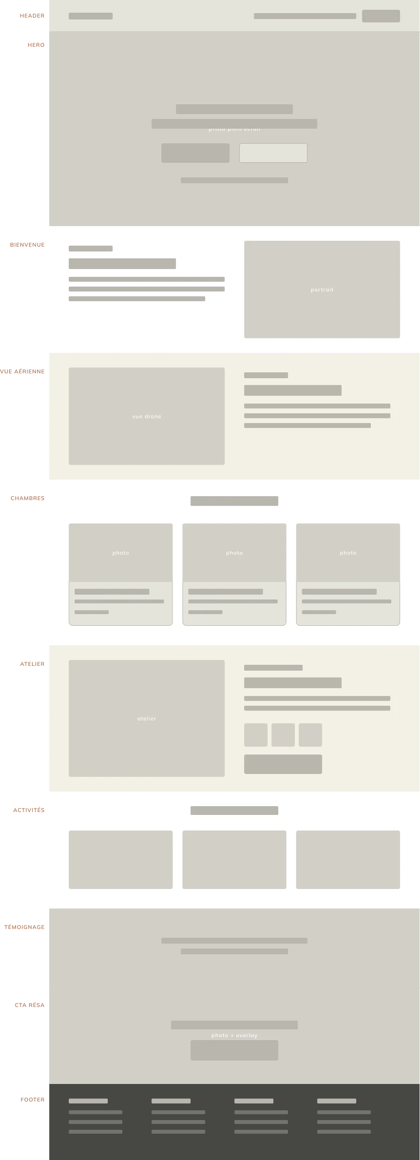
The photography was the project's greatest strength. So I built everything around it: a full-screen hero, large galleries, an interface that steps aside to let it shine. I even saved a whole section for the finest views, the estate seen from above, what you want to see before you book.
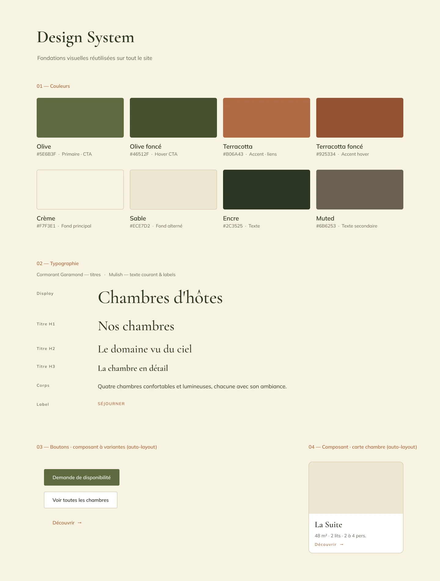
For the colours, I started from a gut feeling: warm, earthy tones that answer the stone and the garden. Olive, terracotta, sand, cream. I ruled out pine green and varnished wood from the start, far too expected for a country cottage.
From those few tones, I built each colour out into light and dark variants, enough to handle backgrounds, hovers and text cleanly. A warm serif for headings, a readable sans for the rest. Then I locked it all in, colours, sizes and components, into a system reused on every page. Nothing is re-picked case by case: that is what gives the site its unity.
The Architecture
Picture it, trust it, ask
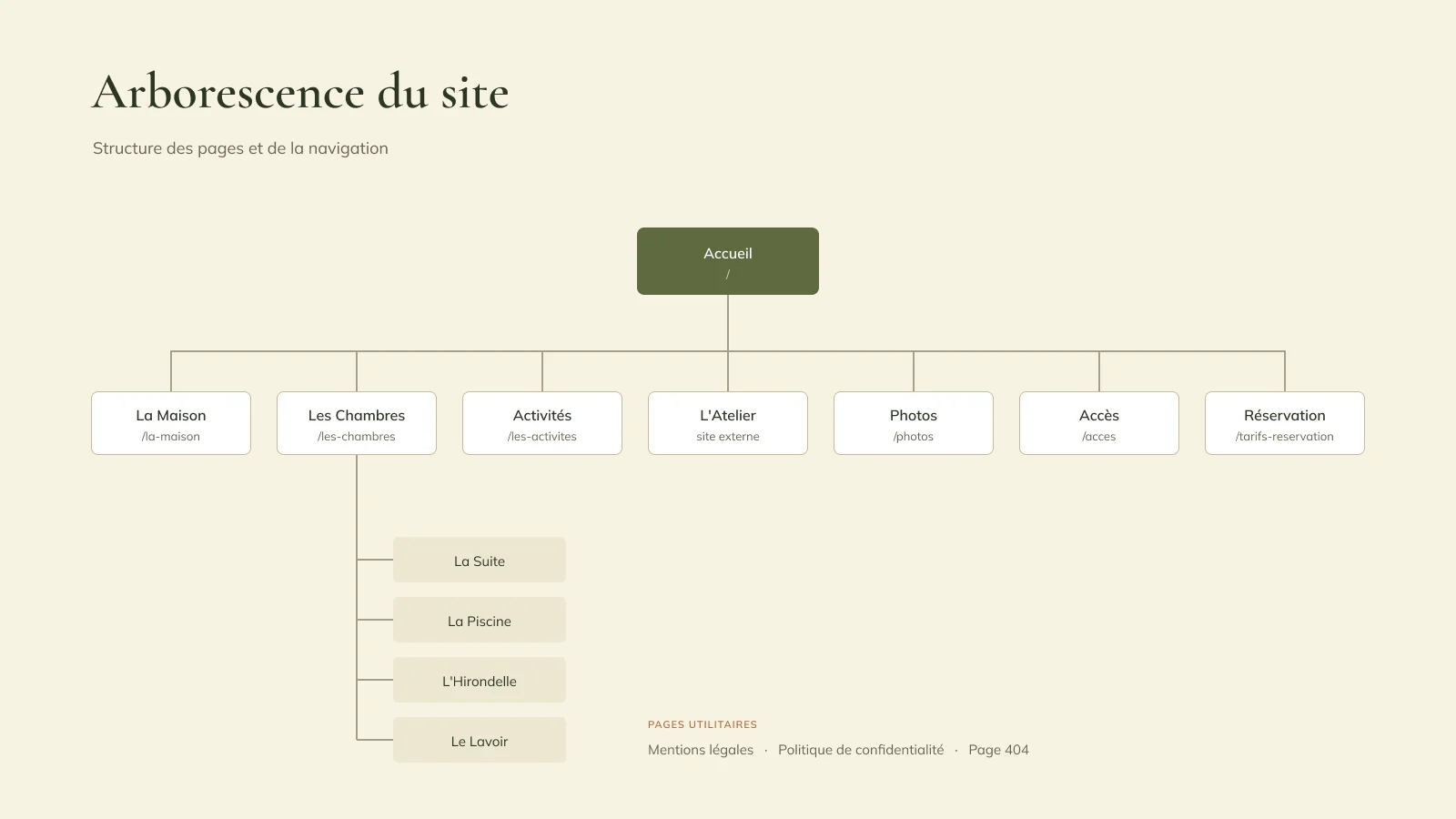
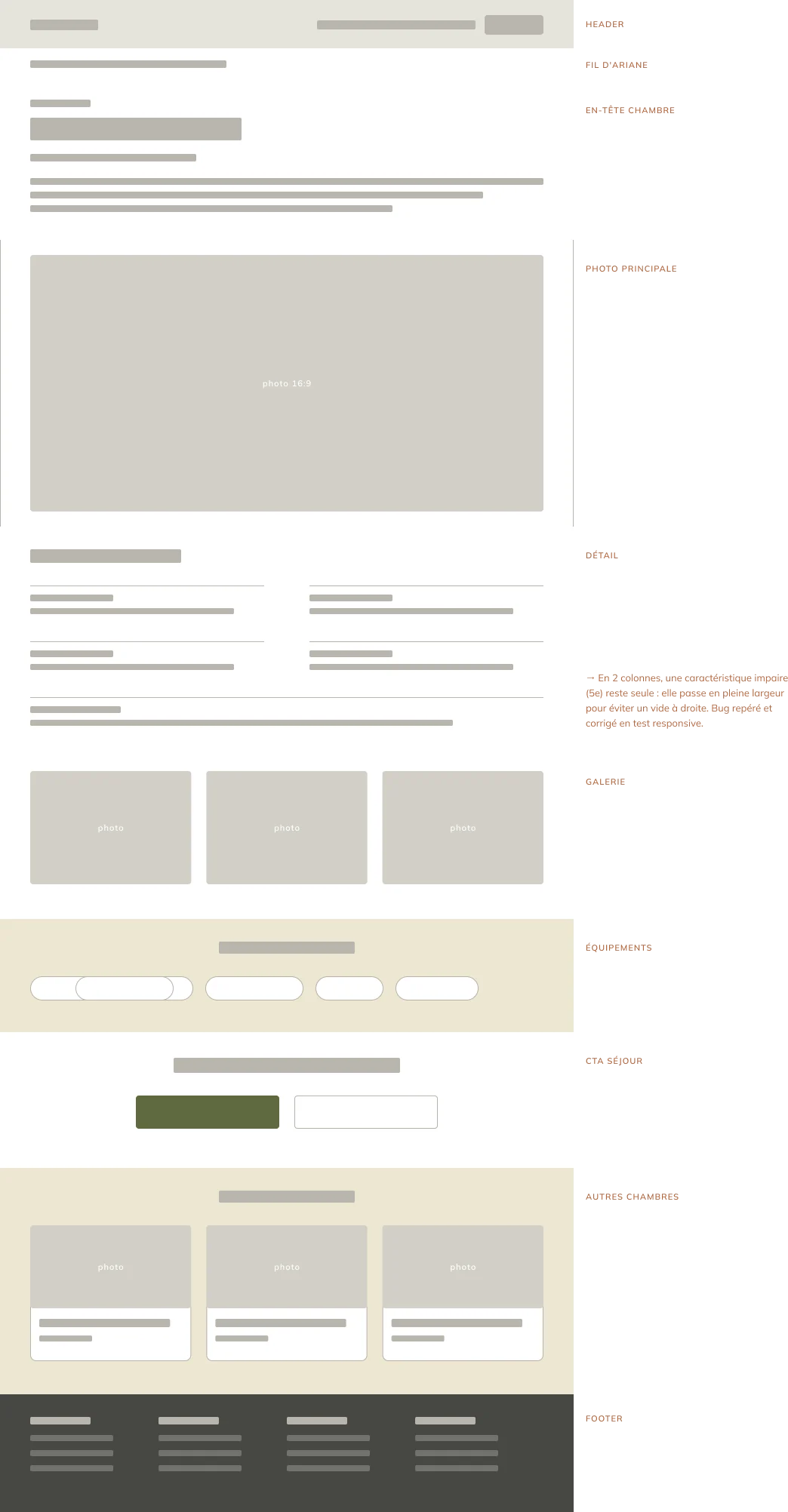
I structured the site around the three questions a traveller asks, in that order:
Picture it. Four rooms, four pages. Size, bedding, starting rate, the view from the window. La Suite and its south-facing terrace, La Piscine by the pool, L'Hirondelle on one level, Le Lavoir facing the Alps. Each has its own character, described in plain words, never in agency-speak.
Trust it. Reviews, directions, prices shown plainly. Forty-nine reviews, 4.8 average: it all existed already, but served the platforms, not them. I brought it up onto the first screen.
Ask. One single action: the availability request. Reachable everywhere, two clicks at most from any page.
The studio has its own page on the guesthouse site. It tells Olivier and Edwige's story and points to the shop. It is the bridge between the two sites, and between their two audiences.
Direct Booking
Taking back the margin
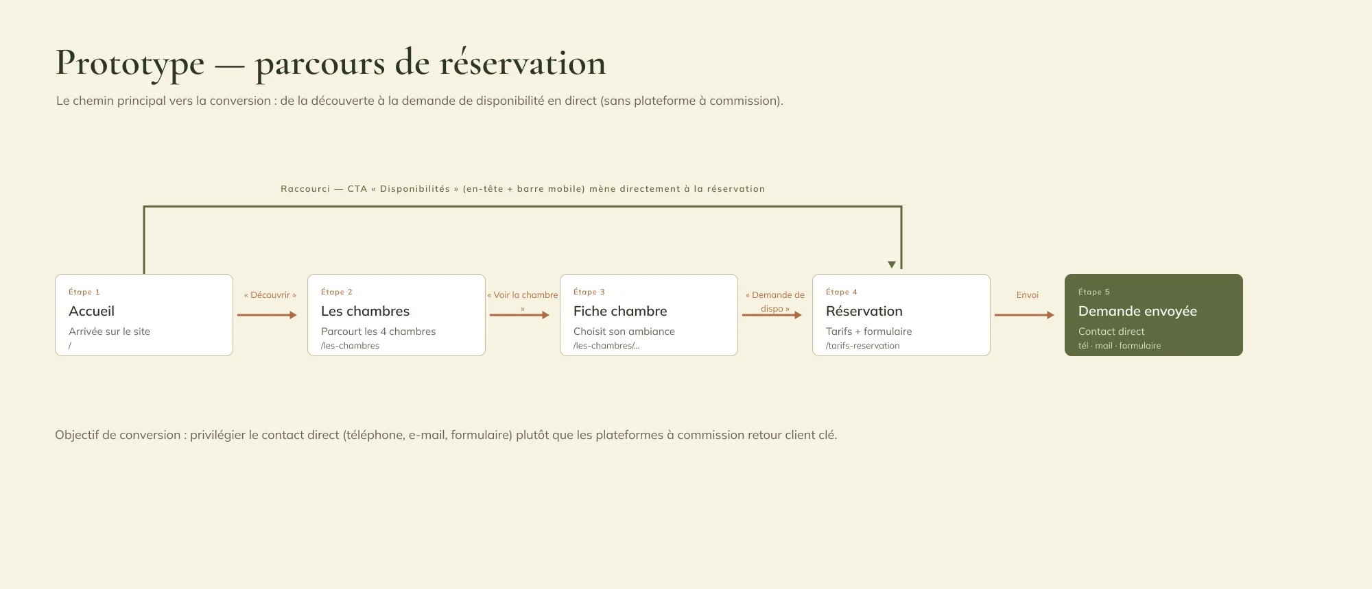
This was the most concrete goal. Every booking through a platform costs a commission. Not to cut the platforms out, but to give visitors a good reason to book direct.
The whole journey leads to one place: "Availability request". Phone, email or form, an answer within 24 hours, no commitment. No link points back to a platform: their ratings are there as proof, not as an escape hatch.
Rates are shown plainly, per room and per season, host's table included. Visitors know the price before they even write. That's a round of back-and-forth saved.
On mobile, an action bar stays at the bottom of the screen at all times: call, or ask about availability. The old site ignored mobile. Yet that is where people look for somewhere to stay next weekend, on the move, with no patience to dig through a menu.
Takeaways
What I take away
The first brief only mentioned the studio. The real need, a showcase that no longer depends on platforms, no one had put into words. It surfaced in conversation on site. Widening the project wasn't an upsell: it was the condition for the shop to find its audience.
On this first freelance project, scoping mattered most. An hour of questions at their place decided almost everything that followed. Best of all, now, is to go and see the result.