An independent wine merchant in Dijon, with no online presence and limited technical knowledge. All communication at a distance by phone and in writing. A website designed from scratch for him to be independent from day one.
Context
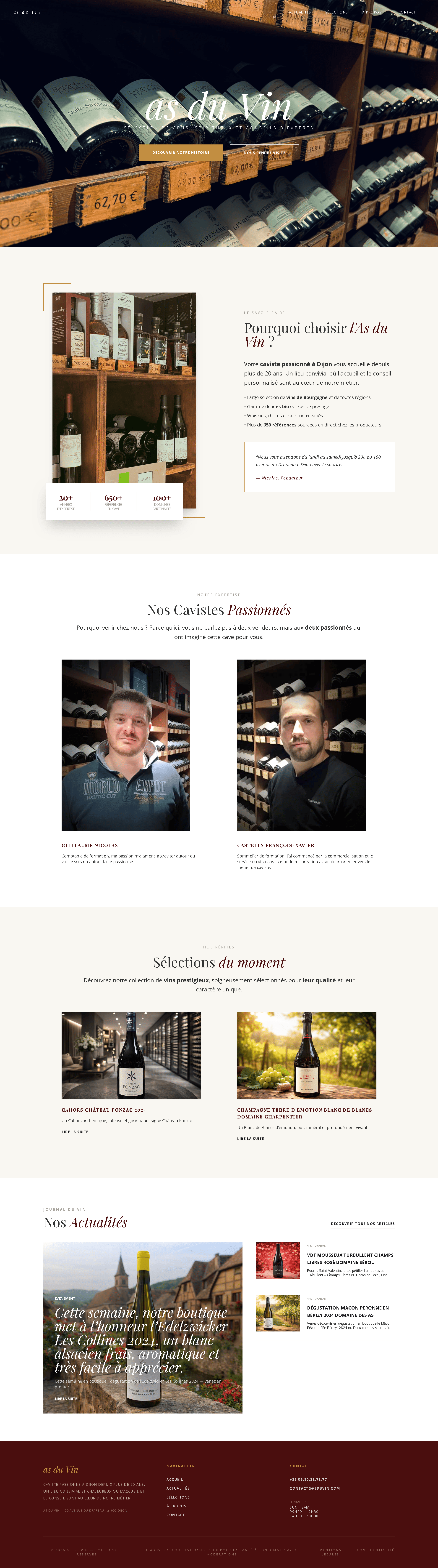
As du Vin is an independent wine merchant based in Dijon. A loyal customer base, a serious cellar but no online presence. The goal wasn't to open an e-commerce shop, but to give the business a digital showcase worthy of what it sells.
All communication happened by phone and messages. That changes how you work: explaining a mockup without showing it, turning a vague feeling into a concrete decision, confirming every choice in writing to keep it traceable.
I managed the project solo, from the first conversation to launch: visual identity, Figma mockups, development, SEO, and back-office training.
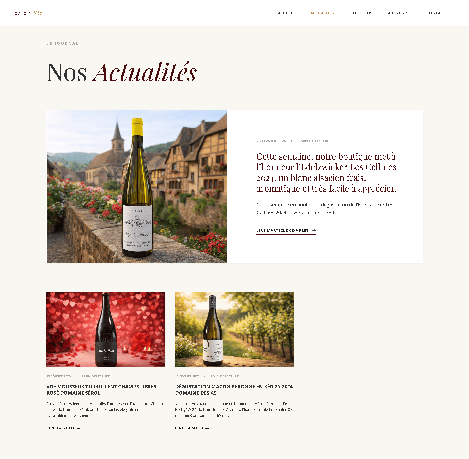
Visual Identity
The direction came quickly: no burgundy, no gold, no aged-wood textures. These codes are so common in the industry that they've stopped saying anything. For an independent merchant whose livelihood depends on his curation, the aesthetic had to make a difference too.
I worked on an earthy palette ochre, warm brown with a serif typeface that adds character without overloading the page. The idea: the site should feel like someone who knows what they're selling, not a specialist chain store.
After each call, I sent a written summary: what we'd decided, why, and what came next. Not for formality's sake to avoid misunderstandings at a distance and have a record if anything changed.
Information Architecture
I structured the content around three concrete intentions:
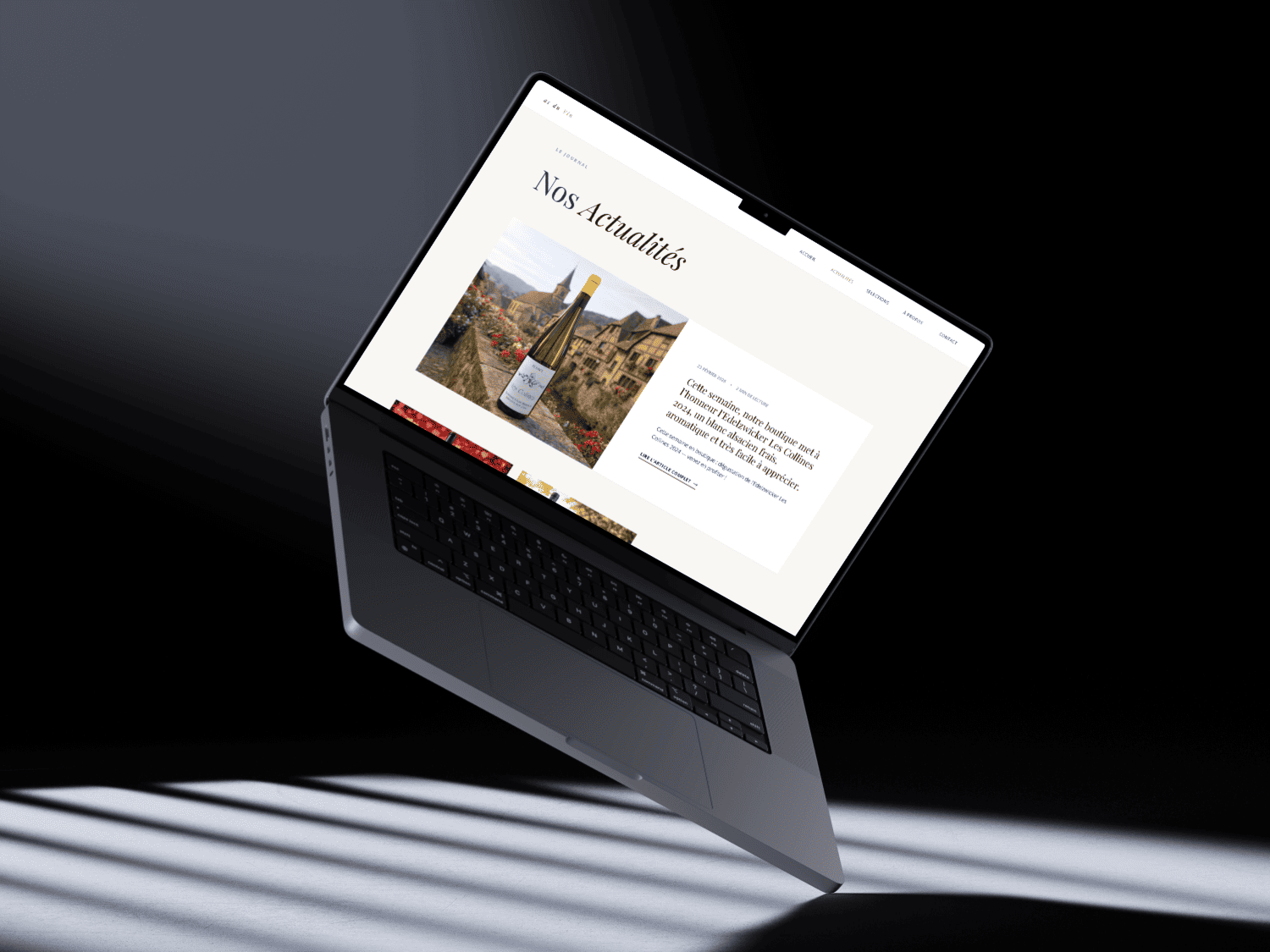
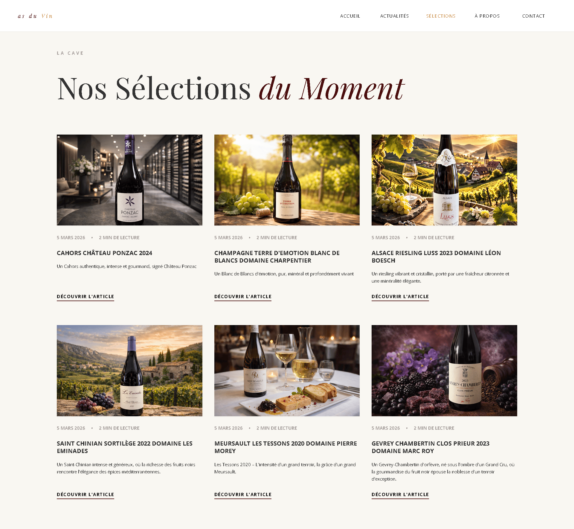
Monthly picks: each month, the merchant selects two wines. For each, he writes a text the estate, the winemaker, what makes it special and attaches the PDF tasting note. It's not an exhaustive catalogue; it's a renewed editorial recommendation. Visitors come back because there's always something new to read.
The journal: a news section the merchant manages independently new arrivals, recommendations, off-pick favourites.
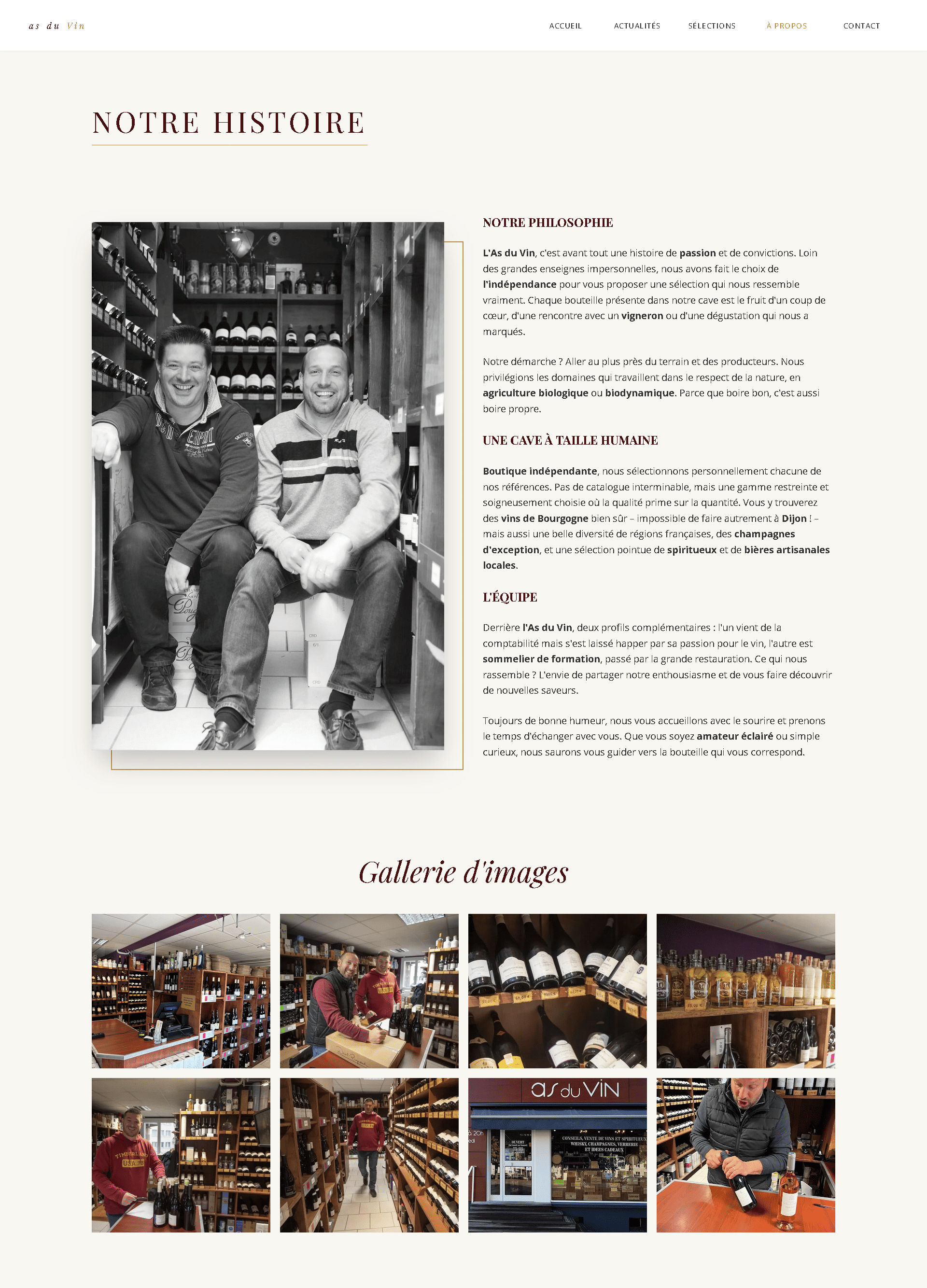
The anchor: an About page with photos of the cellar, so visitors know who they're dealing with before walking through the door.
Two navigation levels maximum. The picks reachable in two clicks from any page.
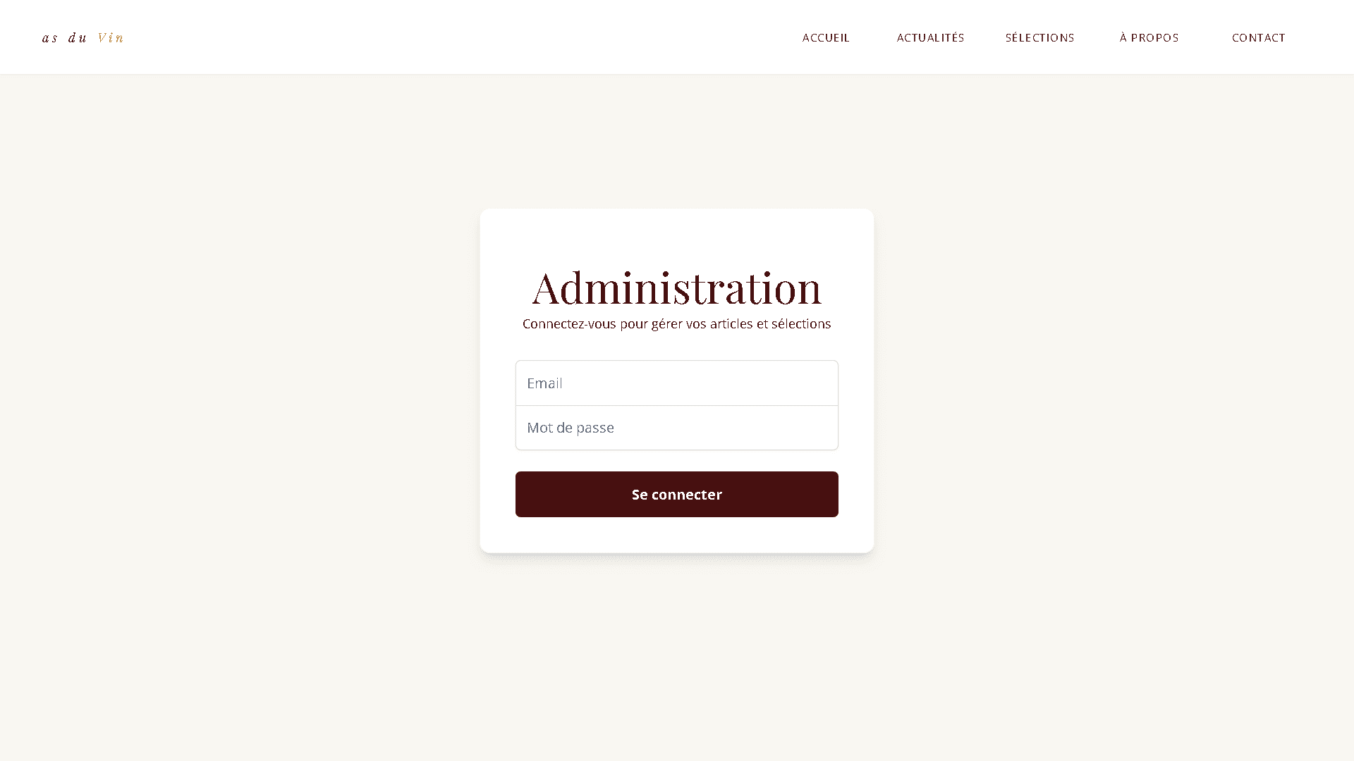
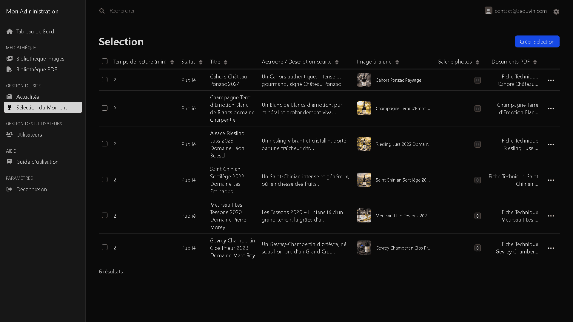
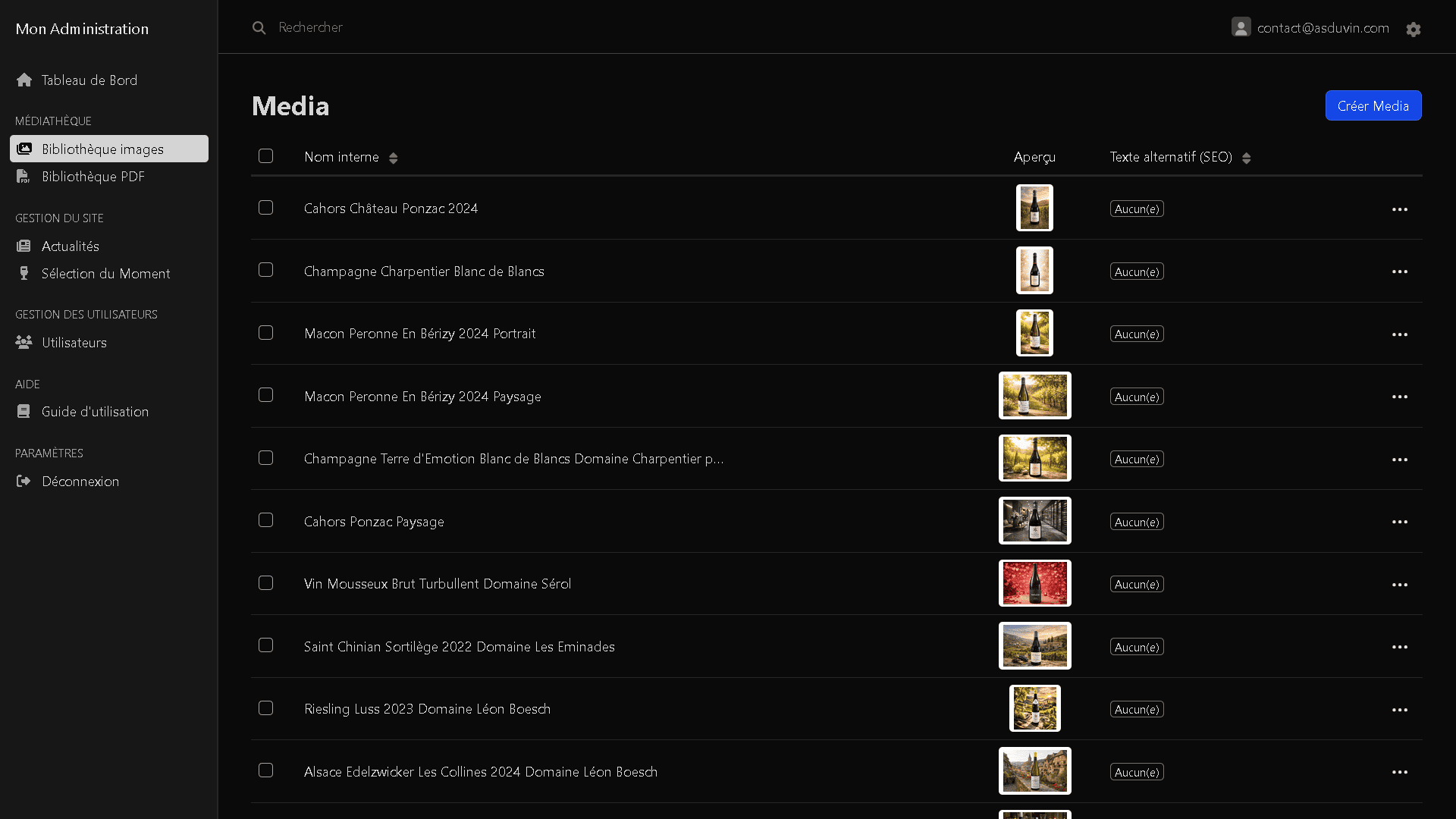
Back-Office
The back-office was the real challenge. The client isn't comfortable with technology. A poor admin panel, and the site becomes a burden rather than a tool.
Using EasyAdmin, I tailored the interface to fit: only the actions he needs day to day. Adding a bottle, uploading a PDF, publishing an article, managing photos.
At handover, I provided a single document: a two-page PDF. No support calls, no confused feedback. He uploaded his first selection within the hour.
Local SEO
SEO was integrated from the structure, not bolted on at the end. For a local site like this, a Google search for "wine merchant Dijon" can be worth as much as a prime high-street location.
Semantic HTML hierarchy, meta tags, alt attributes on every image, content targeted at local search queries around Dijon. Deployment finished with domain configuration and performance testing before launch.
Takeaways
This project reminded me that what makes a website useful is rarely its most complex feature. Here, it was a back-office a wine merchant can open independently and manage without help.
Working without ever meeting in person also forced me to be precise in how I communicated: less shared intuition, more exact words. Explaining a typographic choice to someone who doesn't know Figma is an exercise that changes how you think about design.